Friday, September 21, 2018

Plastic Beach, a Beautiful Image of Waste


The digital band known as the Gorillaz has made its quirky mark on the music industry through its use of eclectic sounds and vibrant imagery. The “band,” as it were, is an ensemble of four virtual members created by mastermind Damon Albarn. Each has their own unique and detailed story, which fit intricately together to make the narrative of the Gorillaz band. Their 2010 album, Plastic Beach, adds to this narrative of the band, but it is also a densely packed lyrical criticism of pressing environmental issues.


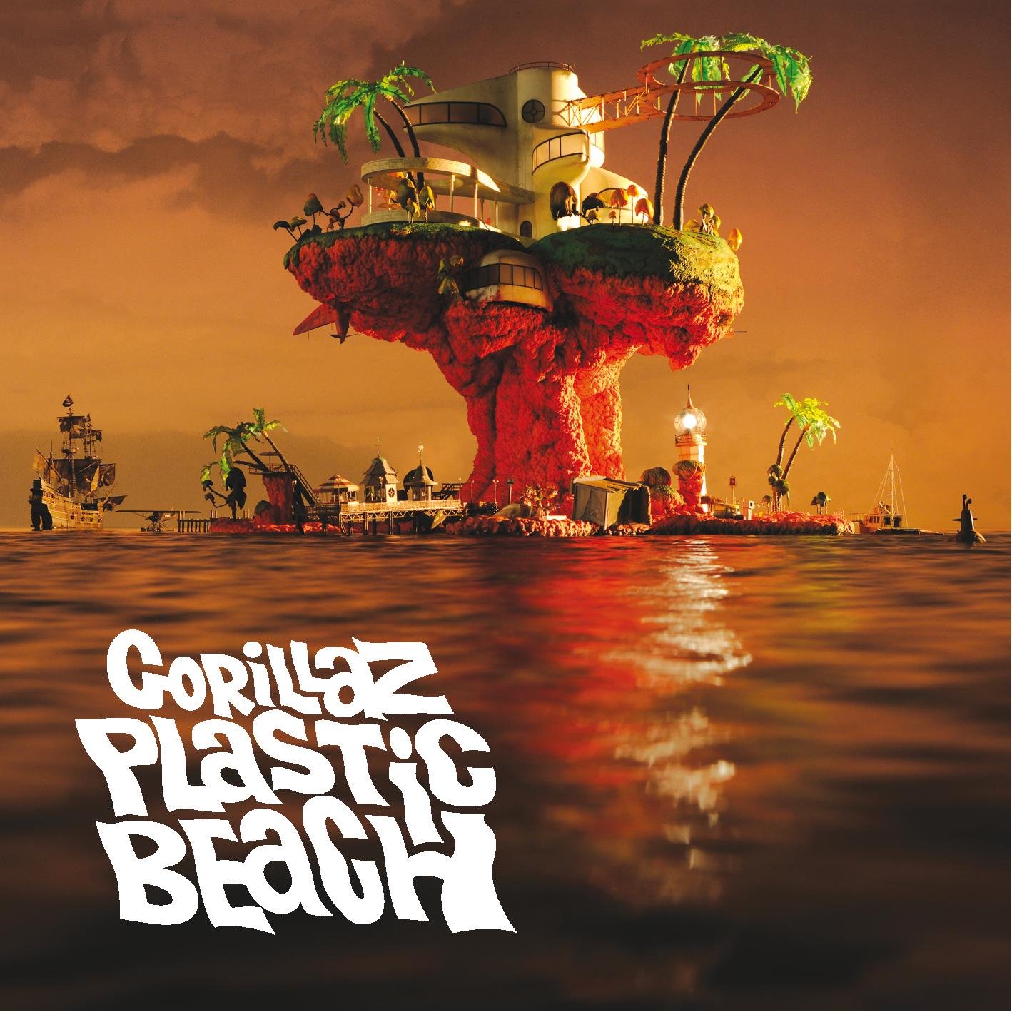
If we had only the name of the album to go off of, Plastic Beach, we could probably ascertain the nature of the album’s commentary. “Plastic” meaning fake, “beach” meaning some type of alleged paradise. The album cover shows an island, which we can safely assume is the proverbial Plastic Beach. We view it at a distance from the water, seemingly while swimming up to the shore. The divide created between the viewer and the beach by this stretch of ocean not only serves the cover well from a compositional standpoint, creating an interesting space for the band name and album title to appear, but it also creates a feeling that we are looking at a fast approaching picture of man’s fate.


The beach itself is made up of all of the plastic that has been discarded into the oceans. The shape of the island very clearly resembles a large, exploded mushroom cloud, at the base of which are dilapidated huts and tiki bars, fishing docks, and washed up sailboats. Once we’ve identified the familiar shape of the island, we can analyze its underlying iconic signification (an icon due to its resemblance to what it alludes to). When one thinks of a huge mushroom cloud, probably the product of a devastating nuclear explosion, they naturally associate the image with destruction, desolation, death, human avarice, war, and greed. And when such a symbol of total destruction is formed out of plastic waste, it is given new specificity. The accusations are clearly on an environmental front.


The forsaken shores symbolize our tendency to abandon ship when our mistakes catch up to us; when we’ve realized our lifestyle of waste was never sustainable. Then, rather than remedy the situation, we just build on top of our waste. A futuristic mansion rests on the top of the mushroom cloud, a beautifully constructed metaphor of unapologetic profit at the expense of our planet. The plastic is painted green to look like grass, painted to disguise the ugliness of what’s underneath. Plastic trees are installed throughout the island to perpetuate the illusion that such a place could ever support actual life.


After the opening track, an Arabic orchestral intro, we hear “Welcome to the World of the Plastic Beach,” featuring artist Snoop Dogg. Snoop asks politely but firmly for our attention, to tell us “The revolution will be televised, and the pollution from the ocean, now with devotion.” This is but one of many lines articulating the Plastic Beach. It is a isolated phenomenon contained on one single island. This Plastic Beach is the world in which we live; the world we have created.


This cover alone delivers a brutally honest message, communicated well with recognizable and powerful symbols. When followed by sixteen enlightening tracks, it is nothing less than sobering.

Thursday, September 20, 2018

Captain Marvel's Lead


After seeing the most recent Avengers movie, Avengers: Infinity War, the ending cutscene got everyone’s attention. The reference to Captain Marvel was small, but something that took most viewers by surprise. Now the official movie poster and trailer have been released and it is quickly becoming one of Marvel’s most anticipated movies. But there are some interesting things about the newly released movie poster.

As shown, Brie Larson is playing the lead role Captain Marvel. Something I feel like most people don’t know though is that Captain Marvel in the Comic series was originally male. I believe this sudden change in lead roles from comics to movies has a lot to do with the MCU’s (Marvel Cinematic Universe) lack of lead female roles. Atleast female roles that have gotten their own movies. This could be a push to help support Women’s equality. That it’s not always the man saving the world. Especially the way things were left in the most recent Avengers movie, we can not help but think as viewers that the distress call to Captain Marvel is anything less than a call to save the “Avengers, Earth’s mightiest heroes.” 


In the background you can see one of the jets that Brie Larson’s role will fly in the movie, something that brings a bit more realism into the audience's eyes. Becoming a fighter pilot is no easy task, but it is something that is not impossible.

By watching the trailer and looking at the poster, the viewer gets to see that Captain Marvel in the beginning is a “normal” living woman that is also a jet pilot, which is featured in the poster. She has a normal life that is possible for other to live. It’s real. People can look at her and feel kind of a connection. Until things take a twist and fantasy falls into her life. She becomes someone with superpowers that has the strength to defeat those trying to hurt others. She becomes the Heroine that is needed.

As a pretty consistent viewer of the Marvel series, it is apparent that Marvel gets people that are good intentioned and are believably a hero/heroine, to then amplify the situation, increasing the “evil” in order to increase the “good.” Which is why I believe so many people can relate to these types of movies. Because they can relate to the good in the lead role. At least we all want to relate to the good.

I believe this poster has just enough realism in it to draw a crowd to the theatre with the knowledge that there is going to be a good amount of fantasy because it is a marvel movie. Overall it is a good ad that I’m sure has gotten the attention of many Marvel Fans.

A Biker's Identity Crisis

Mayans MC, a spinoff of the widely successful TV show Sons of Anarchy, made its debut into the FX universe on September 4th. Mayans MC tells the tale of several members of a outlaw motorcycle gang as they deal with the consequences of being involved in illegal activities, including the drug trade and dealing arms. In addition the gritty crime action, the show is also able to focus in on the familial dynamics within the gang and its affiliates, and the issue of where identity and loyalty should be placed in such a cut throat world. 

Set in southern California near the US-Mexican border, Mexican-American culture and the characters desire to remain loyal to their roots plays a prominent role within the show itself. Upon the show’s announcement, the FX network released this poster, to advertise as well as artistically tease the show’s Hispanic premise.

Visually the poster is designed well—the artwork within is centered, creating symmetry that is attractive to the eye. There are not too many words and the font remains consistent and complementary to the theme of the poster. There is no white space, as the whole poster is colored with various shades of red, green, blue, brown, and gray. However, these colors do not make the poster any less visually appealing, and serve as symbols as well. In addition to the colors, other—and more subtle—symbols on the poster include the ancient Mayan symbol behind the main subject’s head, the skeleton aligned on the left half of the biker, and the desert landscape.

The use of semiotics allows for deeper analysis of these symbols and their significance in relation to the deeper themes of the show. The symbols help signify the importance of Mexican-American culture within the show: a skeleton representing the artwork common around the Mexican holiday of Dia de los Muertos (Day of the Dead), the shades of red and green found on the Mexican flag, and the shades of Mayan blue placed on the upper section of the poster. All of these aspects of Mexican-American culture can in turn signify the large theme of identity and where loyalties lie within this violent universe. The considerable use of black and red tones within the artwork represents violence and conflict-conflict involving clashing cultures.

The idea of being loyal to cultural roots is not just limited to the plot within the show, but also had a role within the show’s production.

The concept of appropriately representing the minority experience within the United States had been a goal of the showrunners since its creation. In an interview with The Hollywood Reporter, show creator Kurt Sutter discussed his mission to find show writers that could relate and accurately portray the characters’ experiences. Following months of research into the culture of Latin-Americans living in the Southwestern region of the United States, Sutter was able to sign on 6 more show writers, consisting of 3 men and 3 women, all of which were of Mexican-American decent. In addition, Sutter only hired Latin-American actors for the roles that required them to avoid whitewashing the show to create a genuine atmosphere. Sutter’s dedication to being loyal to the Mexican-American cultural ideals through proper representation gives the show an authenticity that is hard to replicate within today’s pop culture.

Analysis with the use of semiotics allows for a deeper understanding of the deeper themes within a piece of media. In this case, thematic ideals of being loyal to cultural roots and proper identification is able to be seen by the imagery and symbols with the show’s poster as well as the the show’s production and composition itself. The overall violent and menacing tone of the poster depicted by its symbols helps to represent the theme of conflict(both literal and relative to the characters’ identity crises) that is prominent within the show, while showrunner Kurt Sutter proves to allow for proper identification within Mexican-American culture by avoiding the whitewashed feel that many shows popular in today’s culture contains.


The Dark Knight's Moral Fight


In the Dark Knight movie poster, Batman is standing in the forefront as a bat symbol burns into the face of a building behind him. Debris floats through the air as smoke billows out of the windows of the building. Emblazoned across the top of the poster are the words, “WELCOME TO A WORLD WITHOUT RULES”.

Throughout the entire movie, Batman has to deal with the fact that his, and everyone else’s actions have consequences. Batman has to choose multiple times between saving different people, whether it be the woman he loves or her lover, a group of prisoners or a number of families. Every action he makes has both positive and negative consequences, he must choose between his desires and what is best for society. 

The burning bat symbol on the poster is a signifier of this, and the poster shows that even though Batman is in Gotham, even though he is making an impact in the city, he is still leaving a trail of debris and destruction behind him. The bat symbol was typically used by Commissioner Gordon to signal for Batman’s help when Gotham was on the brink of total chaos. It was symbolic of peace in the city. 

Yet, on this poster, the bat symbol is destructive. It burns the face of buildings, it smokes out the inner rooms. But Batman still seeks justice, even if he knows that it will be costly. He cannot stop the Joker without creating mayhem, which is just what Joker wants. Joker even goes as far as to call himself an agent of chaos. He often doesn’t even seek to kill, just to cause mayhem and watch everyone freak out around him. The first thing that the burning bat symbol signifies is the destructive nature of the work that Batman has to do to save Gotham from Joker.

The second thing that the burning bat symbol signifies is Batman’s struggle throughout the movie to toe the line between being a hero and an antihero. One of his deepest maxims is that he, no matter the circumstances, will not kill. Yet, many times throughout the movie he has Joker in a position where he could easily kill him, yet every time he does not fall to his temptation. The Joker even takes advantage of Batman’s strict moral code by putting himself in positions where Batman could easily kill him. 

Batman constantly fights the urge to turn from his maxims, to stray from what he stands for and take the easy solution to the problem Gotham has. Yet, if Batman does kill, then he can no longer be this shining example of heroism that Gotham relies on. He will be twisted, distorted into just a normal vigilante with nothing that separates him from the common man.

The significance of the burning bat symbol is that it represents both the destructive consequences that Batman’s actions will have, and it also represents Batman’s battle with his maxims, and his struggle to not become an antihero.

The Secret Life of Walter Mitty

The Secret Life of Walter Mitty is a 2013 adventure comedy-drama featuring Ben Stiller as Walter Mitty, a negative assets manager at LIFE magazine who works closely with the famous photographer Sean O’Connell, played by Sean Penn. As Walter’s job is being threatened by the magazine’s conversion to online status and corporate downsizing, a negative sent by O’Connell chosen for the last LIFE magazine cover goes missing, and Walter sets off on an incredible journey across the world in search of it. This post will analyze one of the movie’s widely circulated poster ads through the lens of semiotics.

This poster uses the angles at which the buildings are set to draw the viewer’s eye to the focal point, Walter Mitty himself. Because of Walter’s placement in the center, with his head completely surrounded by the negative space of the sky, it certainly gives the idea of Walter’s head always being “in the clouds”, as he is quite the dreamer (as is referenced in the phrase “stop dreaming, start living” placed at the top of the poster).

The images being shown on the large jumbotrons are actually lives that Walter Mitty imagines for himself throughout the movie. The man has a very overactive imagination that he often gets lost in, presumably because he views his life to be very boring. The poster presents these fantasies as their own miniature “movies” by placing them on these jumbotrons, showing that despite Walter getting caught up in his imagination, he still views these fantasies as separate to his own reality (at least once he actually realizes he’s “dreaming”). Interestingly enough, many of these images are actually other posters used to promote the movie, while the rest reference specific scenes in the movie.

He is also depicted rushing through the bustling city in full business attire, and the strategic position of his arms and legs against the backdrop keeps the poster from appearing too centered and amateur. Walter’s rushed appearance is likely alluding to the film’s primary message: to stop and take things slow, and appreciate the beauty in life without said beauty needing a purpose (for example: O’Connell is shown viewing a snow leopard through his camera, and after lining up for the perfect shot, decides to keep the moment for himself and lets the animal leave without getting the photo).

The typeface is a sleek, minimalist white font that stands out well against the overall blue color of the poster, adding the contrast of a plain font to a busy background in the bottom half and stands out well in the negative space of the top half. While this contrast does look nice, it doesn’t particularly add anything interesting to the overall poster design, but at the very least does not take anything away from it, either.

Overall, I believe this poster to have a wonderful design that intrigues the audience without giving too much away, while also allowing the audience to watch the movie and look upon the poster with a new understanding. The poster has clear eye flow, pleasant contrast, and encapsulates the overall “feel” of the movie without becoming overly cluttered.

Media Critique - "Enemy" Poster Ad

         Enemy (2013) is a psychological film directed by Dennis                                                                        Villeneuve and stars actor Jake Gyllenhaal. The film was produced by M.A. Faura and is based on the novel, The Double by Jose Saramago. Enemy is regarded by some to be one of the most complex, and mind bending films of all time. Besides it’s intriguing plot and brilliant direction, the film has a seemingly simple but interesting poster ad. By taking a semiotic approach, we can appreciate the complexity found in the poster ad, and why I like it so much.
            Enemy is the story of a professor played by Jake Gyllenhaal who find’s a doppelganger of himself acting in a film he rents one night. Confused, he then searches for the man in the film and ends up meeting up with him. The two men are identical and from there the film is unclear whether or not there truly is another man, or if this is all in the head of one man. Throughout the film, there are “random” shots of spiders that are very unsettling. One specific scene has a giant spider walking around the city of Toronto, where this film takes place. At the end of the film, the viewer is left with many questions along with an indescribable set unsettling and uncomfortable feeling. With such a complex storyline, it is only fitting that the movie’s poster ad shares the same connection.
            Enemy’s poster ad consists of lead actor Jake Gyllenhaal side portrait. He is glancing down, in an almost ashamed manner. This look coincides with Gyllenhaal’s character’s emotional feelings towards both his mother and his pregnant girlfriend throughout the film. Another look at the poster and we can see that where Gyllenhaal’s head should be, there is the skyline of Toronto, this is semiotic in both presenting the location of the film but more importantly suggest the idea of the psychological battle he deals with throughout the entire film. At an even closer glance we see the previously mentioned spider crawling through the city’s skyline. With this small detail, the poster produces an entirely different feeling, a feeling of uneasiness. This symbol of the spider not only does a fantastic job as a theme in the film, but also adds that indescribable emotional feeling carried throughout the film. The entire film is from the point of view of Gyllenhaal’s character and the battles he faces in his head. I believe the poster did the film justice by having his headshot take up most of the space, with all the details taking place in his head.
            I believe this movie poster ad does an excellent job at not only drawing connections to the themes of the film, but presents it in a visually simple, emotionally unsettling way, parallel with the film.

The Jungle Book


“The Jungle Book” by Disney’s movie poster depicts aspects from the movie’s main theme: fantasy versus reality. Mowgli, a young boy is raised in the jungle by wolves. There he crosses many dangerous animals and situations. These opposing motifs of charming fantasy and harsh reality are portrayed in design of the poster as well as a deeper meaning than first meets the eye.

The first aspect that draws the eye is the tiger, Shere Khan. As the main antagonist of the film, the tiger represents the threats of the wild. His looming size relative to the child, Mowgli, conveys a sense of danger to the audience, and establishes the unbalanced power dynamic between the two. As shown by how his stripes morph into the trees and bushes of the jungle undergrowth, Shere Khan also represents the jungle itself.

As the stripes move down Shere Khan’s back, they begin to turn into branches and trees of the jungle. With a closer look, the audience can see the silhouette of Mowgli balanced precariously the branches of a tree. His treacherous position further establishes the uneasy, fearful mood of the poster. Since he too is made of the same tiger stripes as the rest of the background, it is implied that he is part of the jungle, but not to the same extent as Shere Khan. This idea is enforced by the film’s plot, as the major conflict between Mowgli and Shere Khan is that Shere Khan does not believe Mowgli belongs in the jungle. The size of his silhouette demonstrates how little control he truly has in this conflict and in the jungle as a whole.

The jungle as shown in the poster has an eerie feel to it. Most of the trees that Mowgli is surrounded by are dead, This represents the ominous death that is expected of a child living in the jungle. “However he does have help, and something that at first glance looks like a tree branch in front of Mowgli, is actually a snake. The snake, whose name is Kaa, Is an antagonist in the movie. He poses threats to Mowgli many times throughout the movie. In the poster Kaa's size is comparable to Mowgli’s, showing more of a personal threat rather than a large looming one. In the poster Both of them look very insignificant, implying that they must help each other conquer the jungle."

In the background there are trees that look alive with leaves. This represents the main tone of the movie and the light and whimsicality that Mowgli, a young and upbeat boy who likes to sing and dance. He is still a primarily innocent and naive character that just likes having fun with animals, regardless of whatever threat they may pose to him. This idea is further reinforced by how he is walking without and caution, about to fall off of the branch into the dark jungle below.

A Few Good Men


Image result for a few good men movie poster
For my media critique, I decided to analyze the movie poster for “A Few Good Men,” starring Tom Cruise and Jack Nicholson. In this movie, Tom Cruise plays a brilliant but lazy military lawyer who is assigned a case where he must defend two innocent marines involving a mysterious death at Guantanomo Bay naval base. The two marines being accused, Dawson and Downy, are under trial for the murder of another marine, Santiago. For the whole movie, it appears that they will be thrown in jail for the rest of their lives unless Tom Cruise can find some way to prove their innocence. By the end of the movie, we figure out that Jack Nicholson’s character, a commander in the marines, ordered a “code-red” on Santiago, requiring Dawson and Downy to kill Santiago in a way that know body would ever find out.
            The movie poster effectively portrays the themes and ideas in the movie. In my analysis, I use semiotics to show why the poster is designed the way it is. Semiotics is the science of understanding what something stands for. In the case for this movie poster, there are multiple nuances that serve as representations for a deeper meaning tied to the themes of the movie. For instance, both of their faces are half dark and half white. This is a signifier for their dark pasts and struggles that continue to haunt them throughout the movie. Specifically, Tom Cruises character is a lawyer who graduated from Harvard and has failed to live up to the high standards that are expected of him. This internal struggle he deals with is what is signified by the dark side of his face. On another level, Tom Cruise’s internal struggle with his past can be a signifier for the internal decision he makes to put his career on the line by accusing Jack Nicholson’s character, a decorated marine, for ordering the “code-red”. If his accusation is wrong, he will surely lose his job. For Jack Nicholson’s character, the dark side of his face represents the lie he carries out the whole movie about ordering the “code-red” on Santiago, a lie we do not come to realize until the end when he finally admits that he ordered it. This lie can also be a signifier for the dark lifestyle many of the marines live and suggests that there are likely other scandalous events that are left unknown and kept in the dark.
            Furthermore, the white outfit Tom Cruise is wearing and the black outfit that Jack Nicholson is wearing is a signifier for the content of their character. In other words, Tom Cruise’s character is a good guy who intends to free Dawson and Downy of their charges and ensure that Jack Nicholson’s character is convicted so that a “code-red” will never be ordered again and that justice is served. His good intentions are signified by the white suit, a color commonly associated with hope, goodness, and purity. On the other hand, Jack Nicholson’s black suit is a signifier for the evil he has committed and the continuous lie he tells even though he knows that Dawson and Downy were merely following orders and that it is truly his fault for why Santiago is dead.
            Overall, these two aspects of the movie poster might seem irrelevant, however, by using semiotics, it is apparent that the designer of this poster intended to illustrate some of the deeper themes of the movie. In this situation, it is the contrast of dark versus light on both the characters faces and suits that depict the two main characters for who they are and the past struggles they have had to deal with.

Better Leave the Dinosaurs in Skeletons!

Jurassic Park is a science fiction adventure film and it tells the story of John Hammond, a billionaire who has built a theme park with dinosaurs by cloning them back to life from the DNA sample found in ancient times. During a preview tour, John invited four individuals and his two grandchildren to see the park before opening to the public. However, during the stay, an employee tried to steal some dinosaur embryos and caused a major power breakdown that allowed the dinosaurs escaped and became a threat.

The poster is very clean and neat with a great deal of white space well organized and used. Remember less is better. The interesting thing about negative space in this poster is that viewers won’t be able to notice the empty background unless their conscious tells them so. The designer of the poster made the poster intriguing and strong concept-oriented so that people won’t be able to realize how the background is solely one black color.

The designer made a smart decision to have a prominent focal point, which is the image of the logo of the Jurassic Park. The image is positioned on one third of the page from the top applying the rule of thirds. The position of the image suggests it is the most important ingredient to the poster. Another thing to pay attention to is that there are smaller things gathered around the focal point to leave a heavy visual weight compared the blank background.

The color contrast in the poster is also worth complimenting, with the bold red and orange seperate it from the black background. The color red used as the background color for the logo seems like rays of red lights are filling the whole logo, and it represents a dangerous atmosphere that is the theme of the movie. The silhouette of the dinosaur implies that the film is going to be heavily based around dinosaurs, which gives viewers heads up of what they will be seeing in the movie. In addition, the position of the dinosaur makes it appear scary, foreboding what could come in the film.

The poster is one of the most simple yet memorable movie posters out there. Although the movie is considered a special effects marvel, not a single animatronic dinosaur appears on the movie poster but a logo. Surprisingly, it works because the branding for the movie is identical to the branding seen in the film’s fictional park.

The designer Chip Kidd chose the T-rex skeleton as the major element presented in the poster, because all that’s left of real dinosaurs are bones. It turns out making the logo an icon that puts the poster into a perfect representation of the film’s deeper themes, which is how people wrongly believe they can create and control the natural world. The nature they create might be artificial, but it still proves too hard to control, so better leave the dinosaurs as bones or skeletons.

In conclusion, the poster uses focal point and color contrast to provide general overviews of what viewers would experience in the film, and the atmosphere and theme of the movie. Despite the fact of the poster being really simple, it demonstrates a great value of design principles and that makes the poster one of the iconic pop culture elements even now.

McDonald's Advertising: Loud and Clear

In Hagen and Golombisky’s White Space is Not your Enemy, we learn about the principles of design, which are exemplified in a McDonald’s print ad depicting french fries in the shape of a wifi signal.

McDonald’s has proven to excel at a minimalistic design in this particular ad, emphasizing the importance of negative space. In this blog post, I will evaluate why the design principles in this McDonald’s ad ultimately make for a good marketing tool, because of its minimalism, and therefore the loud and clear message of the product being sold.

The entire print consists of a solid, bright red background, with just a few french fries in the shape of a wifi signal. The red negative space creates a stark contrast with the yellow fries, which is not only visually appealing, but also places a huge emphasis on the main product of the ad.

The use of color here is crucial to the ad, because the colors are so iconic to McDonald’s, they are instantly recognizable by the public. Golombisky and Hagen state that culture plays into the use of color, which is very effective in this print design in particular. In our culture, we immediately associate the colors seen in the ad with McDonald’s food.

The colors are symbolic of McDonald’s, and therefore very easily recognizable, making the ad clear and directly to the point. The clever visual also makes strong use of iconization by capitalizing on the chain’s iconic french fries in order to highlight its locations’ wifi offering.

It is also important to point out that the fries are the focal point of the ad, as there is nothing else on it. In Hagen and Golombisky’s White Space is Not Your Enemy, they describe that the focal point of print ads are always very important because it is necessary for the audience’s eyes to go directly to the key part of the ad in order for it to be most effective.

Because of the minimalistic design, the ad calls for seamless eye flow directly to the product, ultimately making the audience want to go buy products from McDonald’s, particularly their most popular food, fries.

The call to action is seen clearly in the bottom right corner. There is no question what it is- to go try out the wifi while buying food. The print’s minimalism also calls attention to the only other thing on the print, that being the golden arches of the McDonald’s M.

There is a good use of visual balance in the design, as it does not center everything, and the focal point is not necessarily directly in the middle, but rather more toward the top of the print. Golombisky and Hagen emphasize the importance of balance in print advertisements, especially because of the rule of thirds, and how the human eye naturally flows on a page.

The ad follows most if not all the basic rules of good design principles, and therefore is very effective in its marketing. In this ad, we see that less really is more, as there is so little on the page, yet it is so recognizable, that the message is loud and clear.