Yellow means happy smiley faces, but could also warn of a poisonous flower. Red is the color of stop signs, but also of blood. Bright colors draw the eye, either because they indicate danger or safety. As Kim Golombisky and Rebecca Hagen describe in White Space Is Not Your Enemy, graphic designers, artists, and advertisers can utilize emotional associations with color to evoke a desired reaction from the audience. Even though colors often hold different meanings to different people groups, all people can recognize the natural contrast of complementary colors. Simplicity often carries more weight than symbolism. This principle is put into play in the early promotional materials for the Apple iPod.
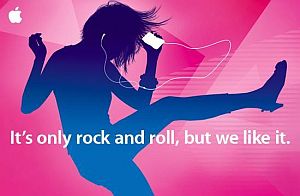
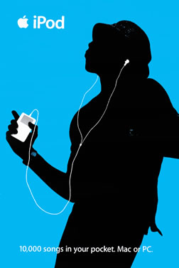 One of the most iconic advertisement campaigns of the past several decades is the Apple iPod silhouette campaign. Bright, tropical-colored backgrounds offset black silhouettes, while the white headphones and iPods brought the viewers' attention to the product. The campaign ran from about 2003 to 2011 and featured both print and video ads, which used simple, striking color schemes.
This campaign differed from Apple's previous advertisements, which consisted of clear-cut, mostly white photographs with straightforward descriptions of the device's features. The new iPod silhouette campaign aimed not to inform the audience of the practical details of the iPod, but to invite them into an emotionally invigorating experience of music, movement, and color.
Most of the print advertisements only used one statement color (usually pink, green, yellow-orange, purple, or blue), but the video spots made a point to switch dramatically between complementary and contrasting colors. Paired with the dynamic motion of the dancers and the upbeat music of the soundtrack, this conglomeration of bright colors brings energy and vibrancy to the ads.
Later advertisements built upon this theme with fresh, updated, analogous color schemes, which abandoned the black silhouettes in favor of color gradients. Even after the iPod Nano was released in a spectrum of new hues, the white iPod and headphones were ubiquitous in these ads. The white text brings the iPod into the foreground. The usage of silhouettes keeps attention away from the faces of the dancers, and the bright, contrasting white iPod draws the eye to the device.
Color variety and personalization--while retaining sleek uniformity and simplicity--is a hallmark of the Apple brand. Apple established with the silhouette campaign a theme of youth, energy, and excitement, all by employing bring colors and contrasts unlike those found in any advertisements before. Even though the silhouette design has run its course, the same tropical color scheme, with a simple Apple logo replacing the dancers, can be found on iTunes gift cards today. The iPod silhouette campaign is memorable not only because of the novelty and popularity of the iPod, but because its colorful, minimalist style was unique, immediately recognizable, and appealing to even our simplest human interests: bright, flashy, pretty colors.
No comments:
Post a Comment